Browns refreshed logo is OK; worst may be yet to come
 The Cleveland Browns unveiled what is essentially a refreshed logo on Tuesday and while there is nothing particularly noteworthy about it, there is also nothing objectionable.
So that’s a win, we suppose.
The team updated the primary helmet logo to reflect “today’s modern Cleveland” with design that “honors the past while evolving into the future. The iconic brown and white stripes stand tall over the orange helmet – a new orange color that matches the passion of the Dawg Pound. The new brown facemask represents the strength and toughness of Cleveland.”
There is also a “contemporary redesigned word mark,” one that is now ” simplistic and utilizes a stronger, bolder font.”
Can’t really complain one way or another about a brighter orange, it is what it is. The helmet logo most likely reflects what the actual helmets will look like when the Browns unveil their new uniforms on April 14, so it will be interesting to see how the brown facemasks look.
Speaking of the helmets, while we tend to like the chrome look, we’ve just never thought it looked right in orange, so if the rumors that the Browns are going chrome as part of the uniform redesign, we’re not sure how good that will be.
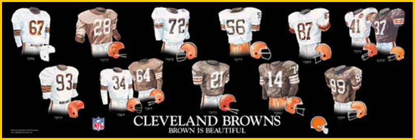
 As for the secondary Dawg logo, whatever. There is nothing that anyone can come up with that will surpass Brownie the Elf, so as long as the Dawg logo is truly secondary and not front and center, whatever. (At least the team is moving away from the B inside a football logo.)
While the logo unveiling was ultimately much ado about nothing, there is some news that has us worried about what the team will unveil when it rolls out the new uniforms in April.
Paul Lukas from Uni Watch talked to team president Alec Scheiner about the changes and the following comment from Scheiner gave us pause (emphasis is ours):
“We took a fairly conservative route with the changes we unveiled today, and then we think our uniforms will be more of a radical change, and we think our fans want that, too.”
Oh boy.
First off, we can only speak for ourselves but if there are fans who want a “radical change” we are certainly not in that group. The Browns struggle enough on the field as it is; they don’t need to compound the problem by potentially dressing like circus clowns.
We know: it’s the players in the uniforms that matter, not the uniforms themselves. But when you have a job to do you want to look professional and the phrase “radical change” doesn’t really fit with the idea of presenting a professional image.
Overall, today’s news probably isn’t all that bad. The Browns stuck with a traditional look and there is nothing wrong with that.
We just hope we can say the same thing come April 14.

Cleveland, where nobody likes anything.
I don’t necessarily dislike, just believe it could have been … better.
i don’t like that ‘wordmark’ is in our sports vernacular.
It has always been there, you just may not have realized it. Every team has one, after all.